

Creating an inclusive and unique social space for LGBTQ+ folks
Summary
After noticing too many of my peers (and myself) having poor times with dating apps over the last few years, especially gay centered apps, I wanted to try to create an overall better experience for users.
Through diligent research, ideation, and iterative user testing I was able to create and style a digital MVP for an interactive dating/social app that allows users to:
-
Filter to view their desired profile types
-
Interact with friends and dates in the same app
-
View potential matches in whatever ways they prefer
-
Easily avoid unwanted attention or other suspicious users
-
Spice up their own profile with personality
Role
UX Researcher
Product Designer
Content Writer
Branding & Visual Designer
Prototyping
Deliverables
User Survey Data
Personas
Competitive Analyses
User Stories & Flows
Wireframes
Mood Board
Visual Design - Style Guide
High Fidelity Prototype
User Testing Results
Tools
Google Forms
Notion
Figma
Canva
Maze
Duration
3.5 Weeks
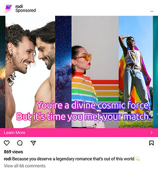
Trending on Instagram!
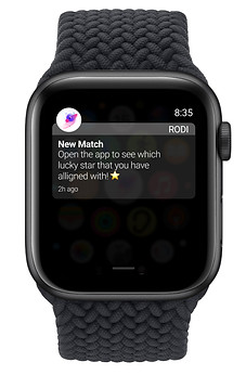
Get notified on the go!
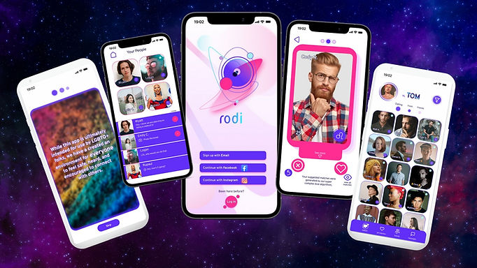
Channel your inner Aph rodi te
The Audience
For an LGBTQ+ focused app the target audience is that community, but also allies who want to make social connections :)
59% 25-35 year old range
33% 18-25 year old range
(Mostly working class millennials and gen-Z individuals)
Location: mostly urban, college campuses, large cities, etc.
Interests: music, art, local restaurants, dating, going out with friends, meeting new people
Attitudes: curious, unique, open-minded, genuine, impulsive
The Problem
Queer people are often marginalized enough by society already and don't need dating apps that make them feel more out of touch with their own community.
Many current dating/social app options either propagate divisive mentalities, allow shady characters to run amuck, perpetuate “hookup only” culture, or are just too functionally frustrating for users to enjoy.
The Solution
By selecting the best qualities of gay friendly dating apps on the market, I was able to create a safe, inviting space for the community to socialize and to be more flirty with one another if they so choose.
Via creating a system for categorizing romantic desires up front, user's intentions are more transparent: hopefully resulting in less subpar social app experiences.
The Process
User Research
From over 70 Google Forms survey responses I learned that...
(80% of survey takers self identified as LGBTQ+)
The 3 most commonly used dating apps were:
-
47% Grindr
-
36% Tinder
-
8% Hinge

85% said photo/account verification through FB or Instagram is a good idea
71% said they had been lead on or “catfished” by a disingenuous profile
68% majority agreed face photos should be heavily encouraged
17% said that current apps were successful at facilitating dates as opposed to hookups
49% majority thought users should be able to send photos without prior matching (barring nudity)
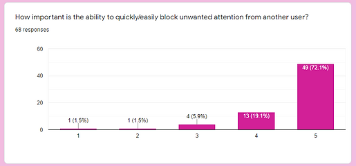
88% have had to block or report someone on a dating app

Competitive Analysis

I analyzed and gleaned key properties from each of the 3 current most popular dating apps that I later used to inform my design decisions, specifically:
Tinder - swiping layout and icon design
Grindr - messages and homepage grid layout style
Hinge - more opportunities for users to further personalize their profiles and simple bottom nav panel


Personas
From the data I collected and post survey interviews with various survey takers, I was able to develop 3 persona types that embody and describe the primary users for the app.


The Serious Dater
The Fun Seeker
The Curious Adventurer
User Stories
This step in the process allows us to better understand the psychology of the user's perspective and their needs in order to narrow down the most important design features to include.
Information Architecture
Highest Priority
-
As a dating app user, I want to be able to customize my profile in an interesting way in order to attract my type of person
-
As a young bachelor/bachelorette, I want to see other people my age with my sexual affiliation within the local area in order to plan dates or meet.
-
As a user, I want to be able to easily block accounts that are annoying to me or harassing me so that I can feel safe.
-
As a queer person, I want a social app that values my uniqueness and so that I can have a compelling and genuine space to interact with my peers.
-
As a user, I want to have an "open to dating" filter/toggle available in order to avoid unwanted attention if I am not looking for anyone at the moment.
-
As a individual with a busy schedule, I want to be able to view multiple profiles at once so that I can streamline my dating selection.
-
As a user, I'd like to be alerted if an account seems suspicious or is using images that are not representative of someone in my area so that I can ensure I am speaking with someone genuine.
User Flows
Now that we have fleshed out our typical users and their behaviors, let's see some of examples of how our user stories might play out within our app, by diagraming user flows.


Site Map
By assimilating a site map we can depict a better idea of how a user would naturally interact with and navigate within the product, and is the foundation for upcoming wireframe screens. This is an essential step as each necessary page/screen is solidified.

Wireframe Sketches


Digitized Wireframes
Content strategy, based on previous sketch ideation and developed using Figma, ~90% of the content had been written at this stage.


Mood Board
I constructed a collection of imagery and animations using Canva that inspired me to pursue a galactic vibrant color palette for the app and to include a way for users to connect via astrology signs.
Visual Design & Branding
Logo Design
I developed 2 logo images using Figma that are meant to resemble astral bodies aligning with one another, the left more minimal and the right more organic with neomorphic gradients.
I then took a poll via Instagram for visual preference opinions.
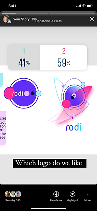

Design 2 wins!
Style Guide
By categorizing all of the visual elements, typography choices, and final color palette decisions into a collective UI inventory I was able to ensure consistency while designing mockup iterations.

High Fidelity Prototype
Account Creation Flow
App Functions Flow
User Testing & Design Iterations
Gauging what worked and what didn't based on a series of navigation missions created for the prototype using Maze. After testing 10+ users, I was able to find and address common usability errors. I also wanted to gain insight into screen layout preference with A/B testing.

.jpg)

1. Improved Matches Screen
Issue: users were often trying to expand a profile by touching the message block instead of the larger profile pic, leading to a missclick rate of 43%.
Fix: added ability to tap an individual message from a user's match to expand info their profile information card modal within Figma prototype controls
2. Rearranged Onboarding
Issue: users were more often tapping instead of swiping to advance to the next screen, and a few stated that being able to swipe to the profile setup step seems more natural than the "I'm In!" button
Fix: added swiping functionality to the last onboarding card continuity, relocated “skip” button to the bottom of screen, and moved the page indicators to the top to make users more aware that they need to swipe to navigate

Old (w/ heatmap)

New
3. Clarified Icons
Fix: added an “oops” text label to the redo button icon and also added a discernable home icon for users to skip the "return to feed" step
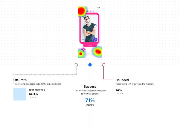


Issue: a few users were tapping the wrong icon to navigate back to home since there was no clear way icon to direct them back to the homescreen
4. A/B Preference Testing
Homescreen
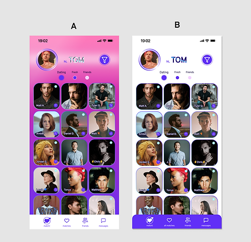
100% chose B over A !
Profile editor / self view

63% chose A over B
Users tended to prefer a more minimal design that focused attention on profile images.
In Conclusion
Key Takeaways:
What I learned it that users often desire a dating or social app to cater to their specific preferences while being intuitive to use and spontaneous enough to not be deemed boring. I would spend more time focusing on maintaining consistent profile view cards for the next iterations.
Therefore an app designer should:
-
Take every request or complaint about functions or form seriously.
-
Provide a meaningful onboarding flow to alleviate future user confusion.
-
Glean successful inspirations from current apps on the market and remix them to reduce cognitive load and make your product the best possible.
-
Remain inspired and think outside the box, people will connect with the app better if there is some personality to it.
Further Development for rodi 2.0:
With more time to further research, test, and develop this product I would most likely aim to:
-
Add more filter features in to accommodate eclectic tastes
-
Expand on quality of life features (new message/match notifications, advanced user settings, etc.)
-
Include more options for preferences during profile setup
-
Create screens for various filter settings and the “Fresh” and “Friends” grid sections
-
Include explore pages - beyond local profiles
-
Ideate more screens for the desktop version teased below
Desktop Version (coming soon!):
In an effort to be as relevant to as many users as possible, we should further develop a desktop version of rodi, beyond this splash screen, and reformat functionality to suit the medium (chat window popup, resizing components, etc.).

